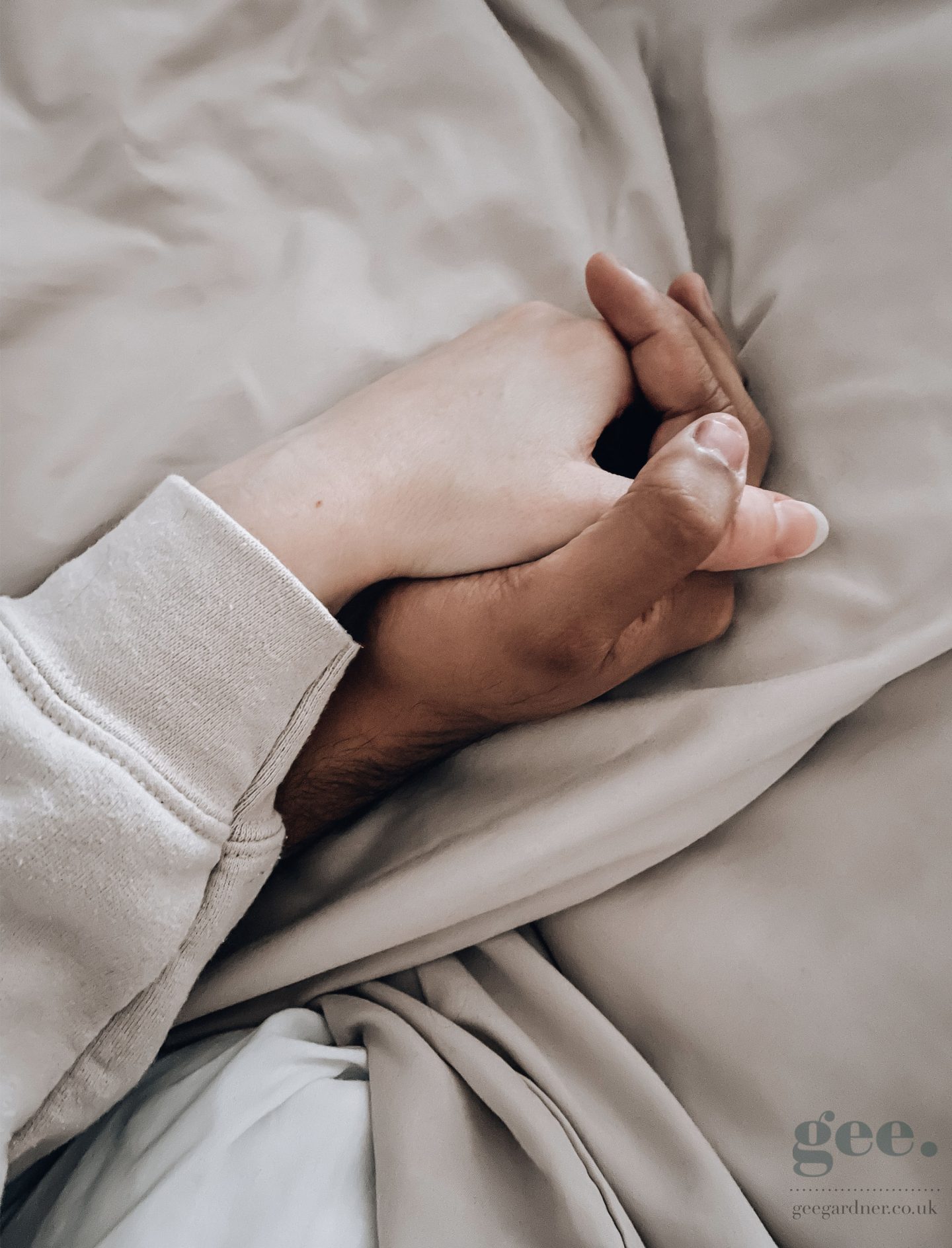
A large part of my job as an artist, particularly when it comes to digital work and branding is creating colour palettes that will work well in unison as well as encompass both main designs and secondary designs. A lot of clients will have a good idea of what colour palettes they wish to work with but often I am given only one or two to work with and create a balanced but interesting colour palette to incorporate across their branding. I have my own library of colour palettes that I will use throughout my work and I am always taking photos of the most random things purely to load up in Photoshop and grab the hex codes for future projects.


I’ve included some examples of how I create some of these colour palettes from photographs I’ve taken because you really can find some brilliant combinations of hues and shades in the most random of places (see below for a classic example of how you can turn nothing into something with lots of potential).
On an unrelated note – this method can be really helpful in interior design work when choosing a colour scheme as you can extract colours from accessories you’ve chose to get a perfect match.


Load your photograph of choice in Adobe Photoshop. The icon for this is on the left hand side in the shape of a mountain landscape.
Select the eyedropper tool and use it to extract a part of the photograph at random using either your finger or an Apple Pencil.

Use the paint brush tool to paint a section of the colours you select onto a new layer.

Repeat the above until you have a selection of shades and hues to work with and pick the ones that complement each other well. Putting them together in strips like I have below or similar helps to give you a better representation of how well they work together which can be especially helpful if you are new to creating colour palettes.


Read my post about understanding colour psychology for a better insight into how to use colour to communicate or invoke a particular emotional message.